Quarantine Visuals: Turning Confusing Rules into Clear Guidance
Overview
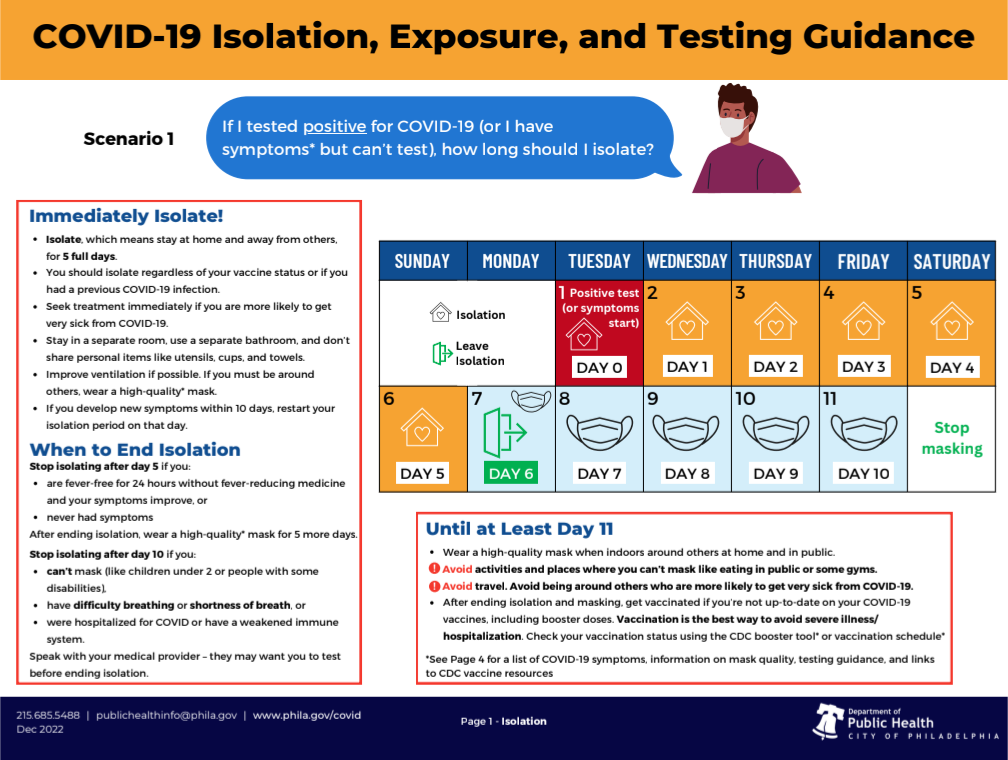
During the early pandemic, when guidance changed faster than people could keep up, we needed a way to make it visible. This visual calendar transformed shifting isolation and quarantine rules into a format people could quickly understand and apply in daily life.
My Role:Concept design, message development, and user testing
Collaborators: Other staff and graphic designers
Audience: General public and public health staff contact tracers
The Challenge
Many residents were overwhelmed, juggling work, family, and safety responsibilities while trying to interpret complex instructions. Guidance around isolation and quarantine shifted often and relied on written or verbal explanations. Public health teams needed a clear, adaptable way to communicate evolving rules that anyone could follow.
Theory of Change
I believed a visual calendar could make guidance easier to follow. By replacing text-heavy instructions with a calendar format, residents could quickly see when isolation began and ended. I proposed this concept after hearing repeated confusion during case interviews. I sketched and tested the first prototypes, then worked with designers and clinical staff to refine icons, colors, and plain-language labels based on CDC guidance. The tool used everyday visual cues to make public health guidance intuitive and actionable.
Impact
The visual aid was deployed across the city’s testing and contact tracing programs, improving communication consistency and comprehension. It became a core training tool for hundreds of public health staff and was later shared with other health departments and community organizations. The project demonstrated how design and empathy can work together to make complex information clear and useful